2022
Alexandra Molta, Suebin Kang, Gabriela Sorto, Rui Sun
UX Research, UI Design, Prototyping, Animation
Figma, Miro
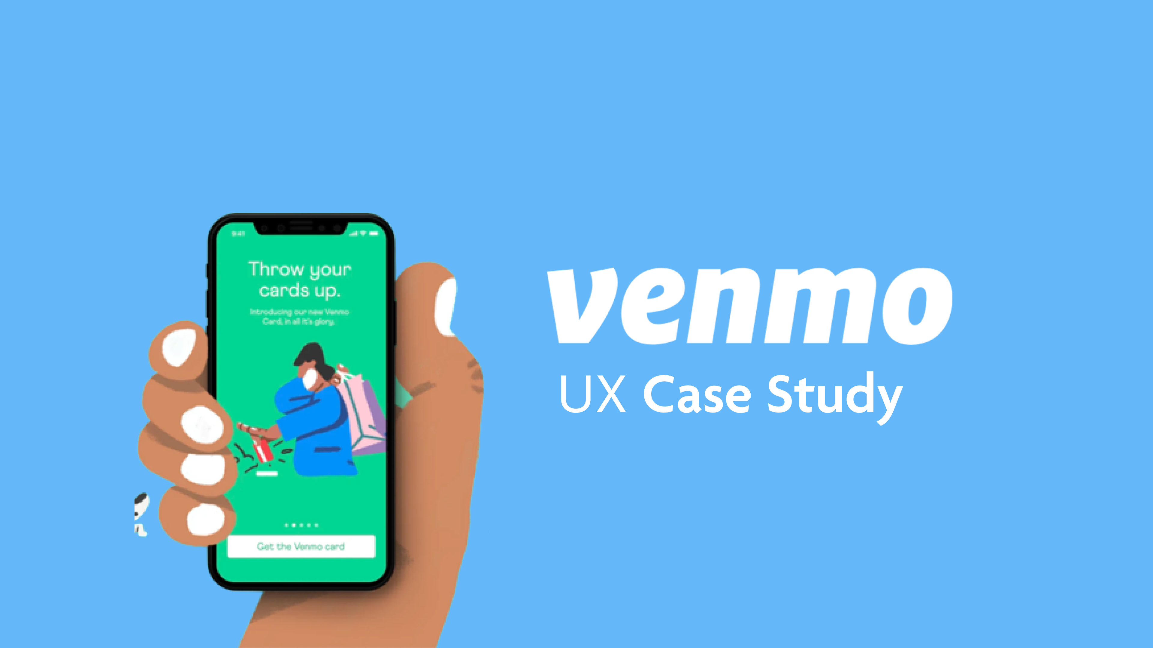
Venmo is a popular digital wallet app that has a user base of 50 million active users. It is targeted towards Millennials for sending and receiving payments directly. Although having a large user base and doing the job of splitting bills and transferring funds successfully, It has some pretty significant UX problems and usability issues. In this project, we are focusing on the overall product and not just the aesthetics of Venmo. However, Venmo is ahead of its market competition in terms of popularity and user acquisition. But we believe, no matter how big and famous the product gets, its core value should always remain focused on its target audience. we also wanted this to be an experience where we would solve problems for an application with a large user base.
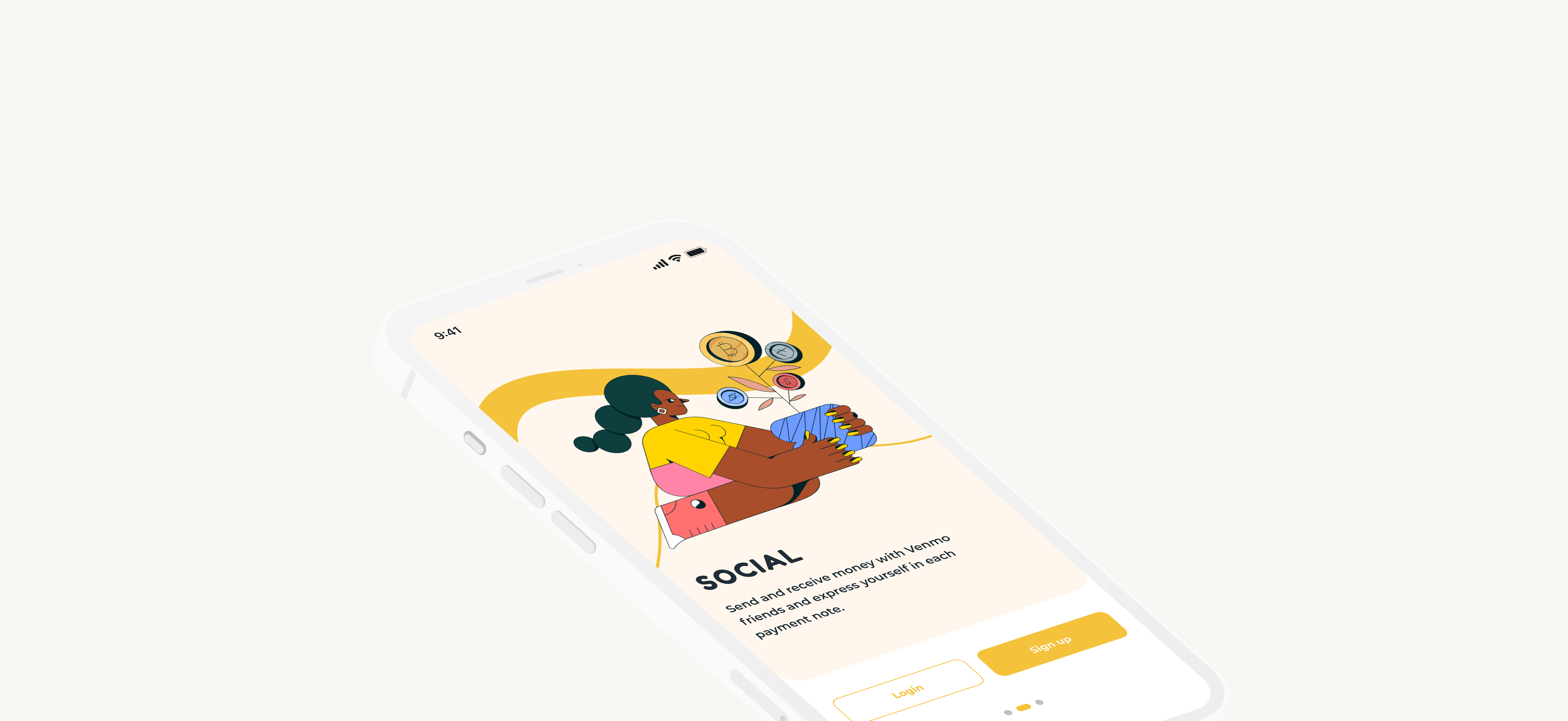
Venmo solves the pain point of the user related to sending and receiving payments from others. However, I was surprised to see that the app lack some basic UX principles. Right from the start, you won't notice any onboarding experience. Many users have complained of not being able to figure out how to add their bank card and add friends: 2 of the Venmo's primary functions. With Venmo trying to be a social platform and a P2P, it confuses people and questions the privacy of the app. Overall the UI is intrusive and hides essential features inside the menu bar.
A p2p app that can be used internationally, expanding it targeted audience from millennials to Gen z and Boomers.

To begin our research we asked people around the city who were also regular users of not just Venmo but any money transaction app to further identify pain points, frustrations, needs, and desires with existing products to determine how Venmo could improve this experience. Our goal was to learn about the context of use, what they like, what they hate, and any feature they want in the want with a p2p app.
What products exist to request, send, and split payements.
How do users interact with the existing products?
What are users current pain points with the existing products?
How are users completing transacations internationally?
Which features are essential to have a successful and stress-free payment
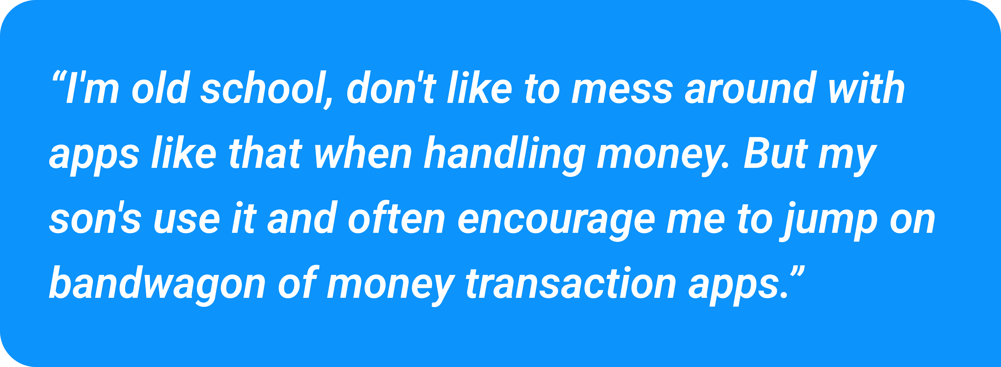
Are users more comfortable with the old school methods of payments or are they leaning towards the digital side of it?
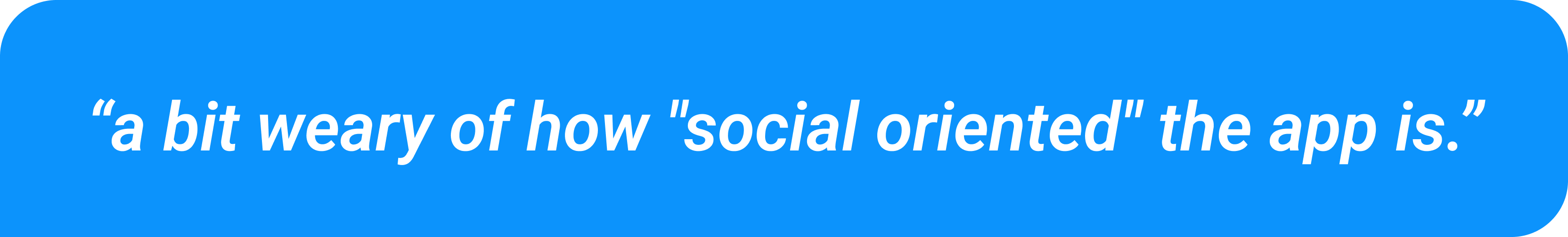
Users have a concern for the social media aspect and need assurance of privacy
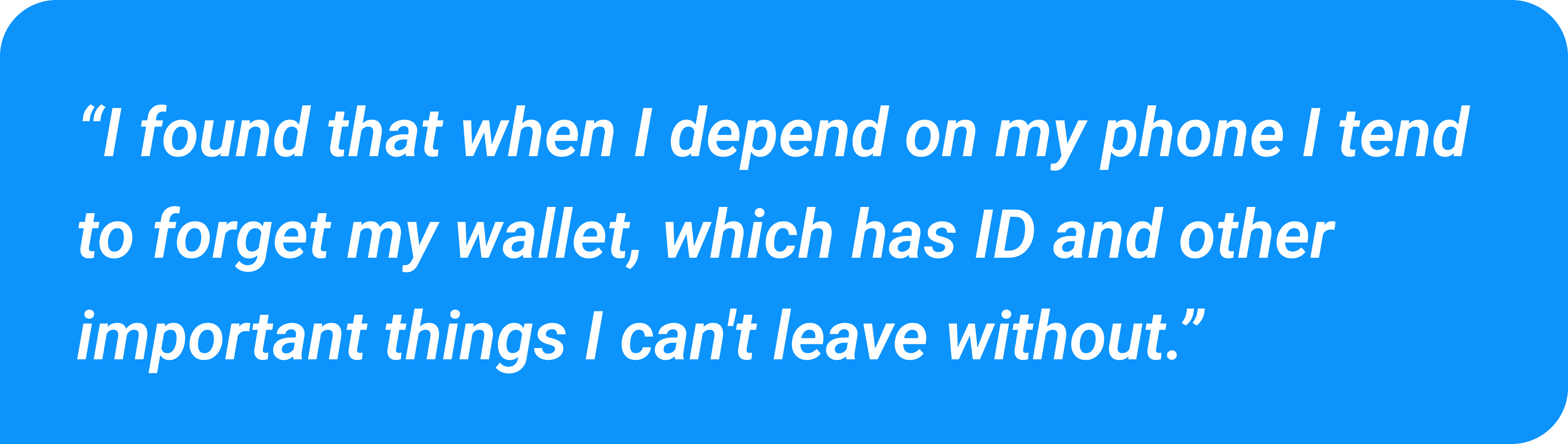
Users would like to be able to keep all important cards in a digital wallet fashion within the app
Onboarding process leaves user feeling overwhelmed and confused when met with the homepage
A dashboard with monthly and weekly spendings is paramount when dealing with payments
Too much information on screen makes users feel overwhelmed, they'd like a more guided and minimal experience
Interface feels cluttered and unorganized with important settings being hidden such as changing privacy settings
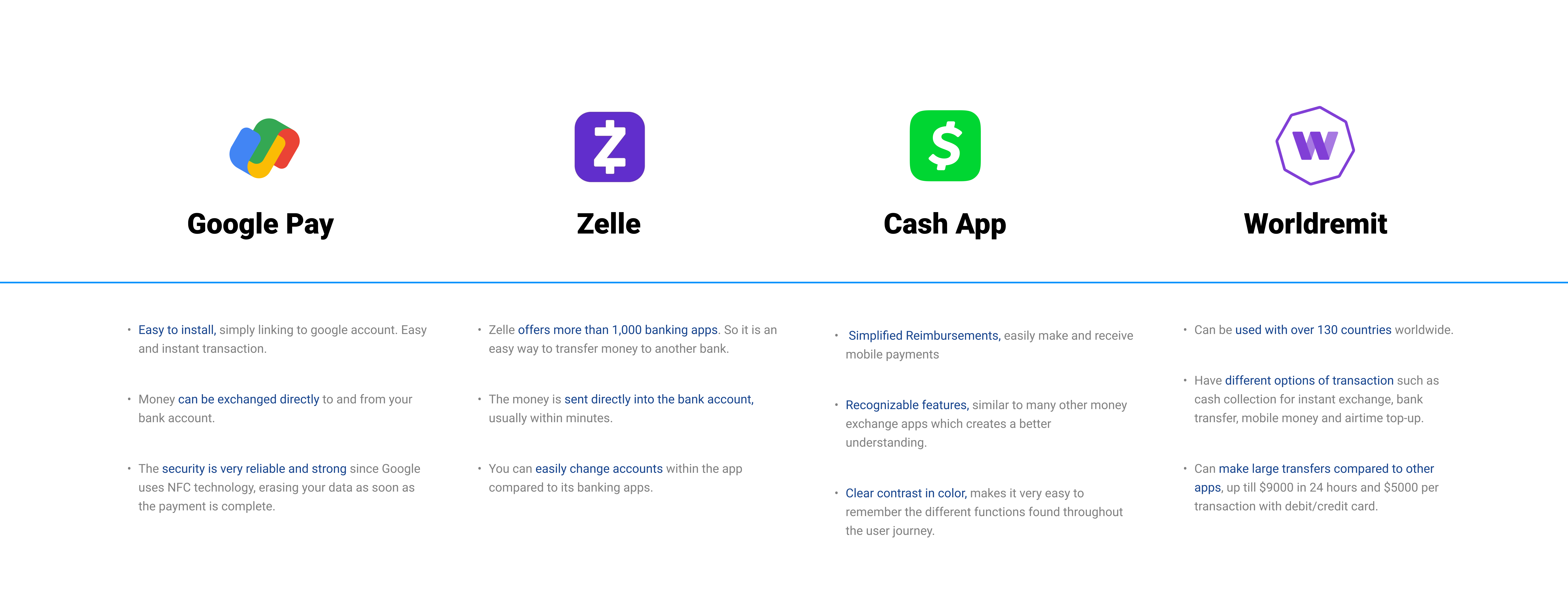
Competitive analysis was conducted to identify competitor's strengths and weaknesses to inform Venmo's features and information structure.
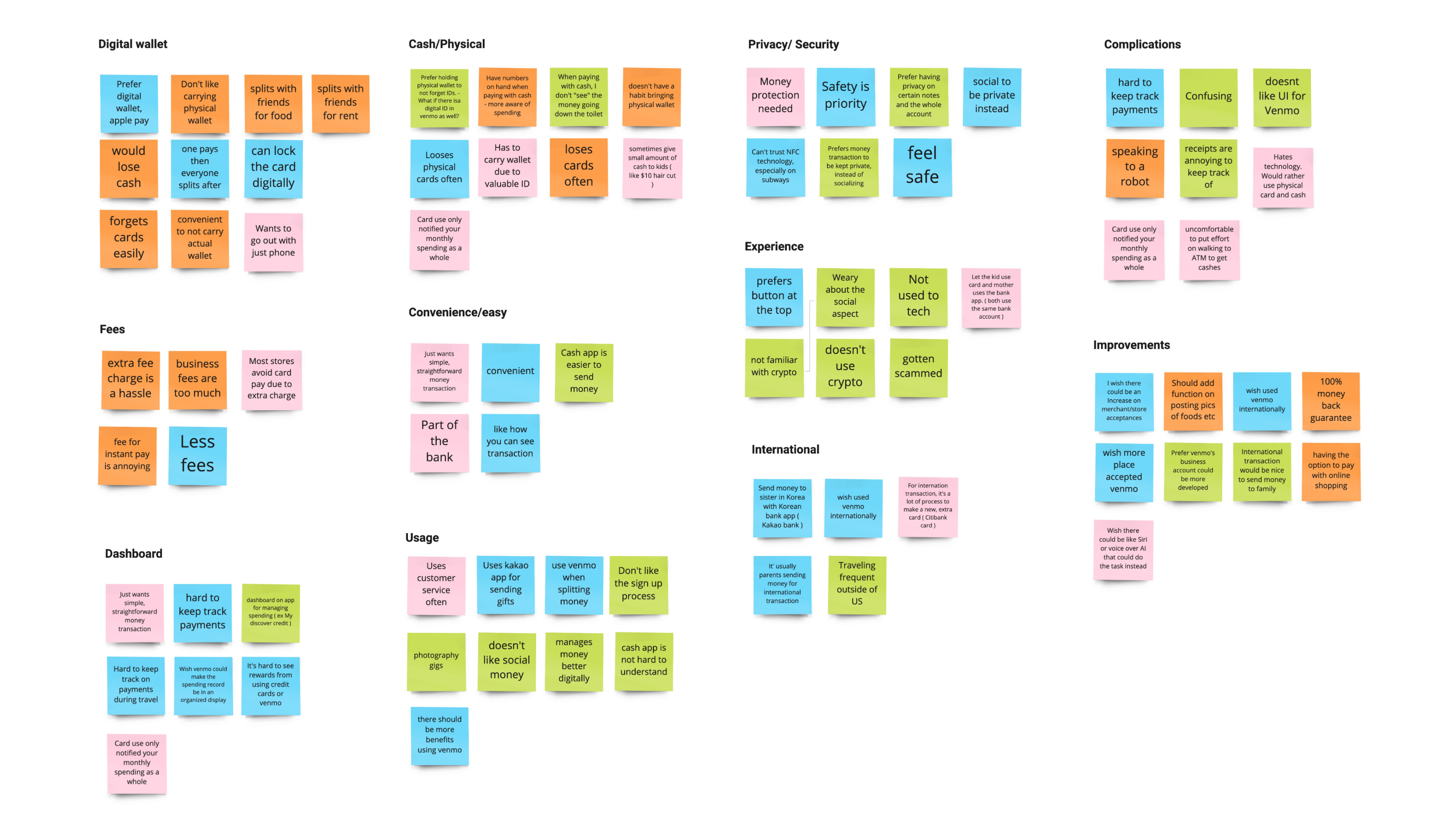
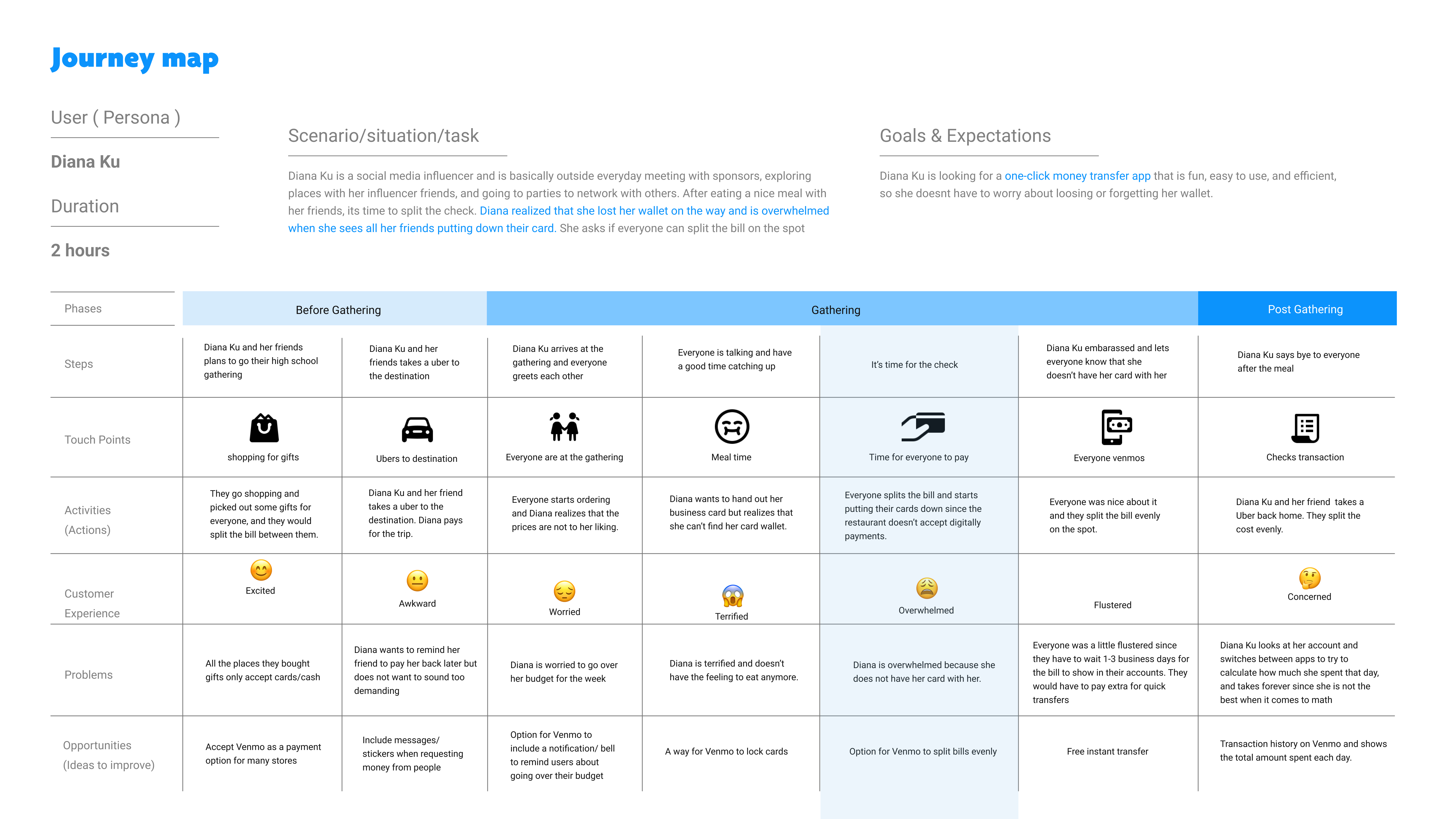
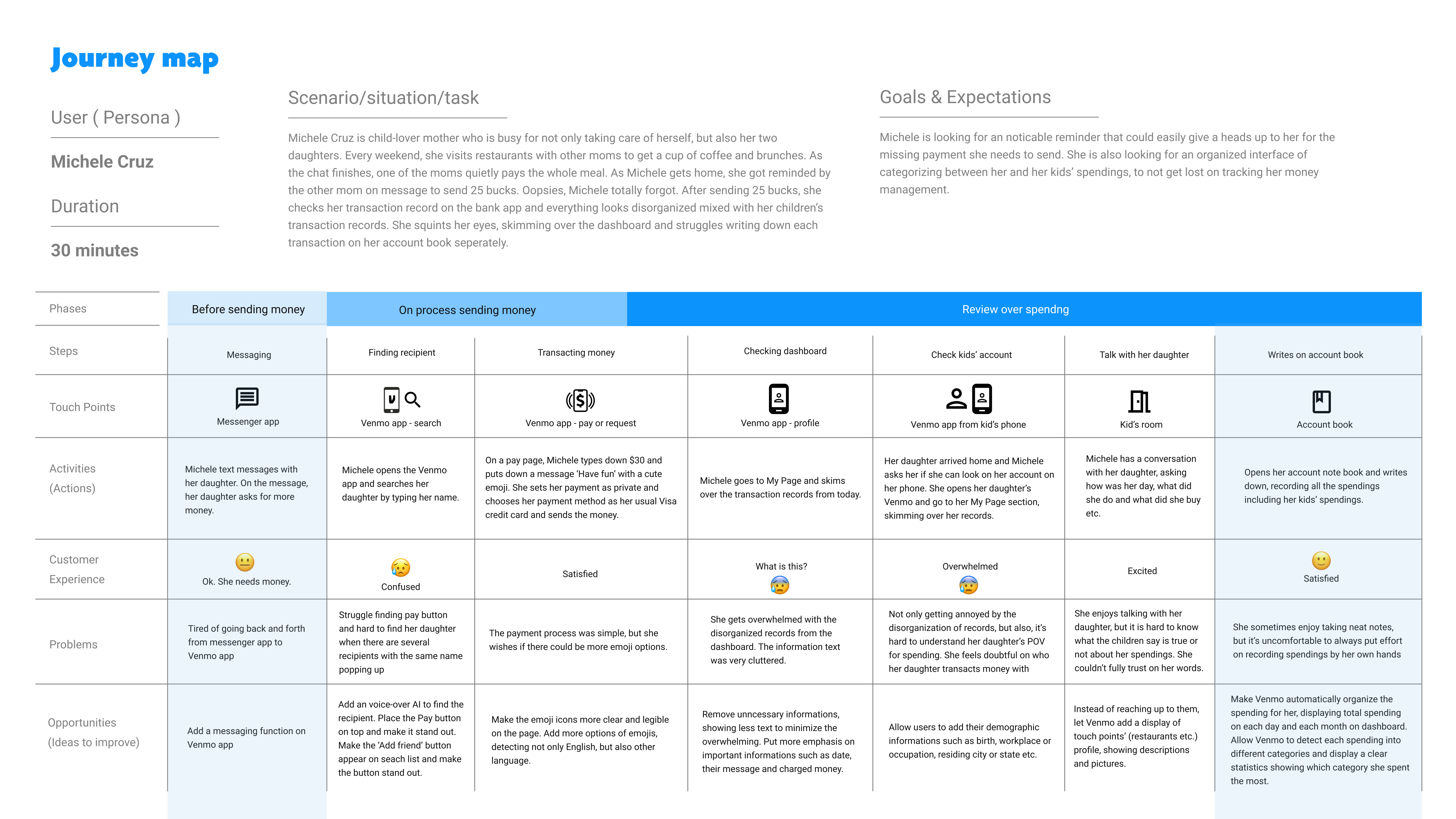
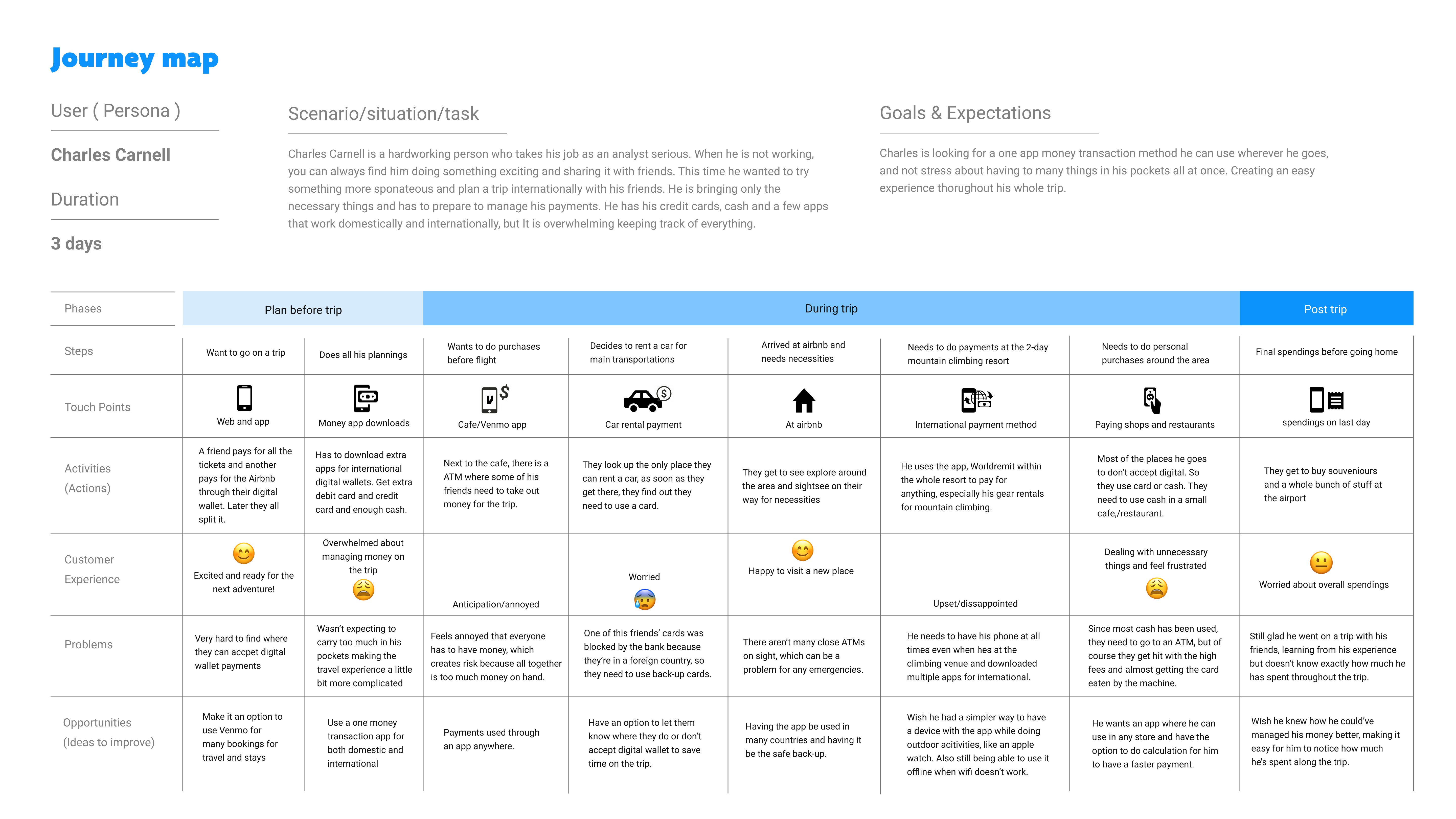
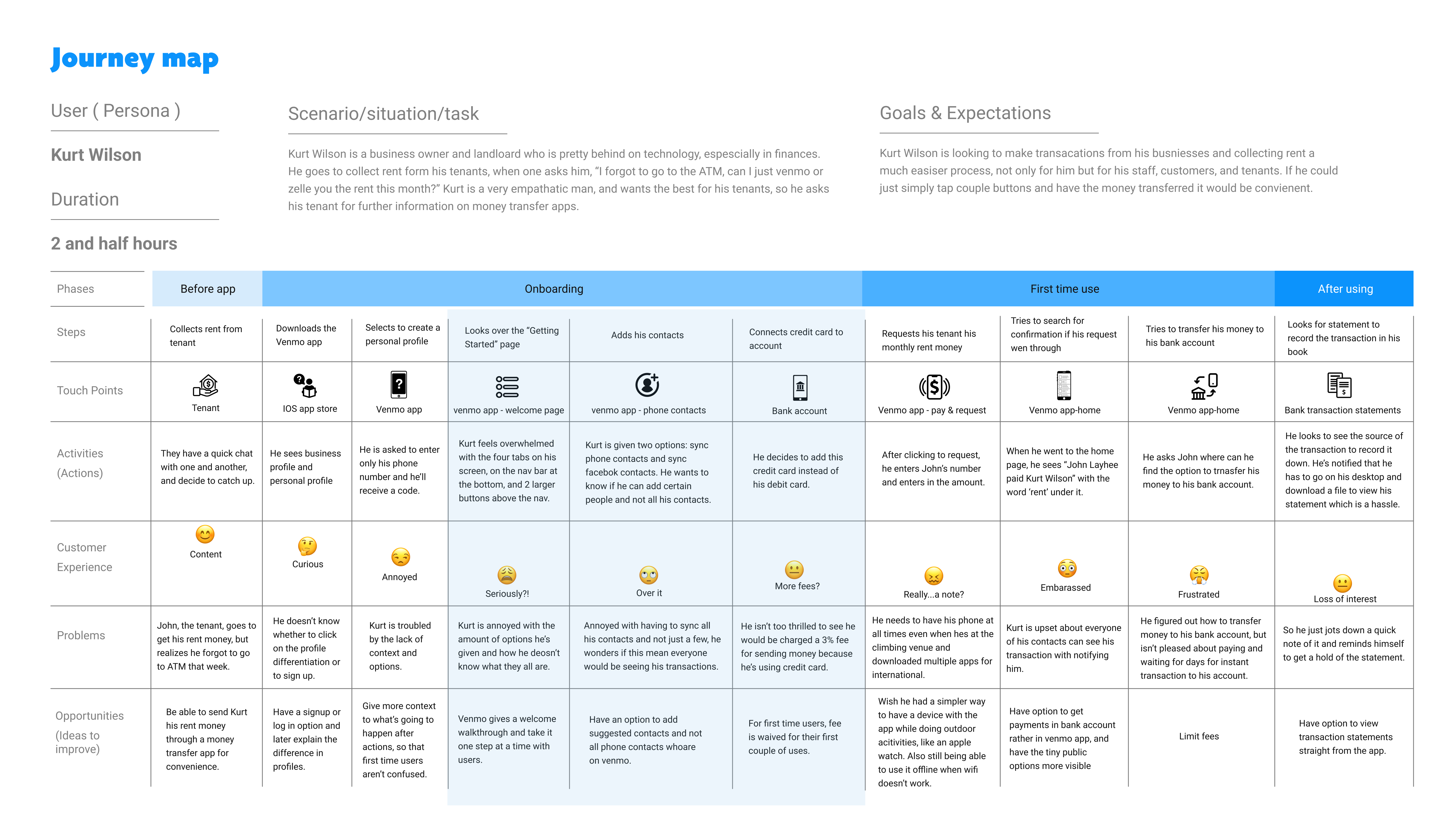
After conducting user interviews, all the participants responses were synthesized to identity themes, opportunities, and features that Venmo could focus and improve upon.
An affinity map was created to identify high level themes and group similar insights gained from the user interviews.
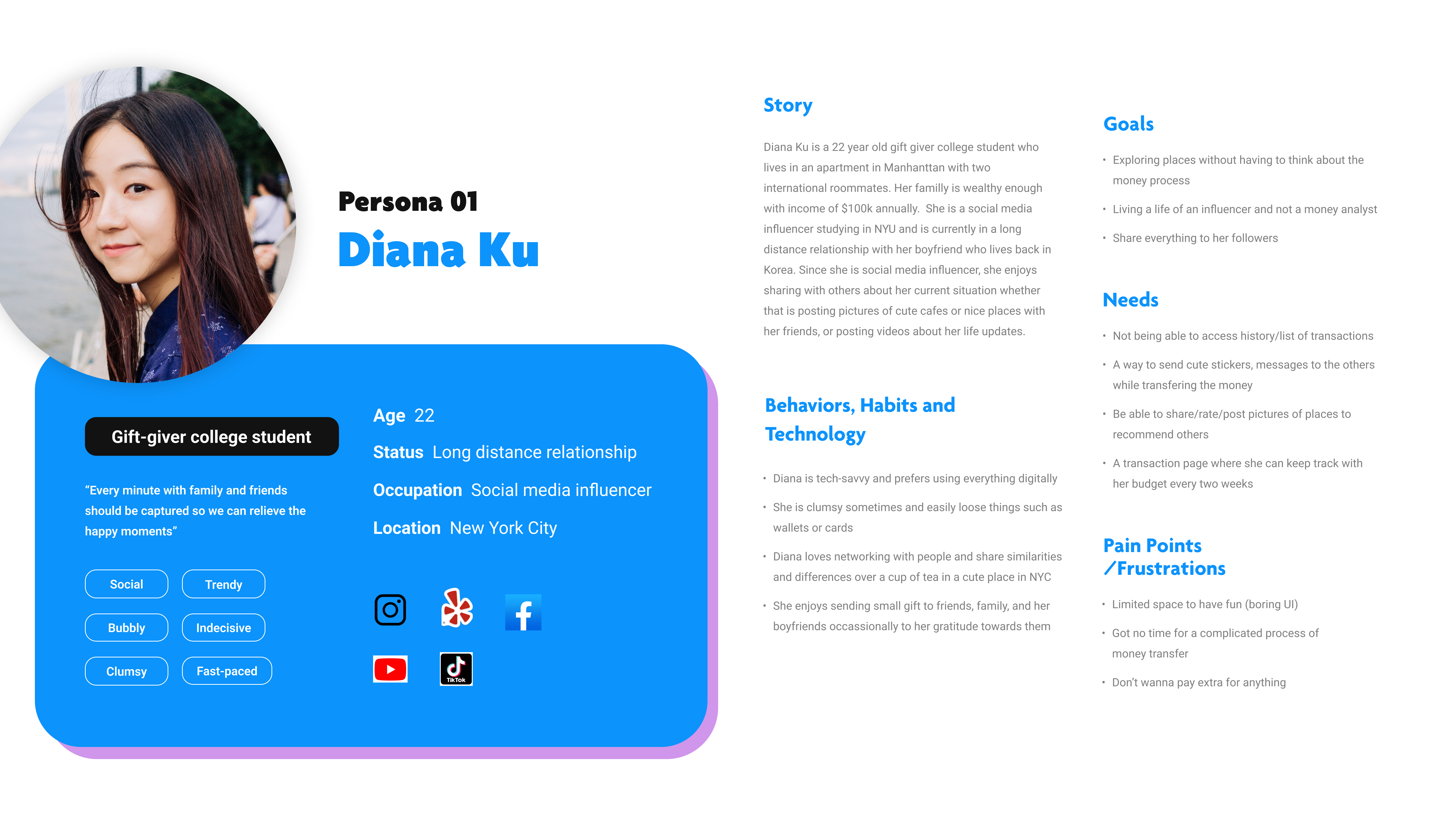
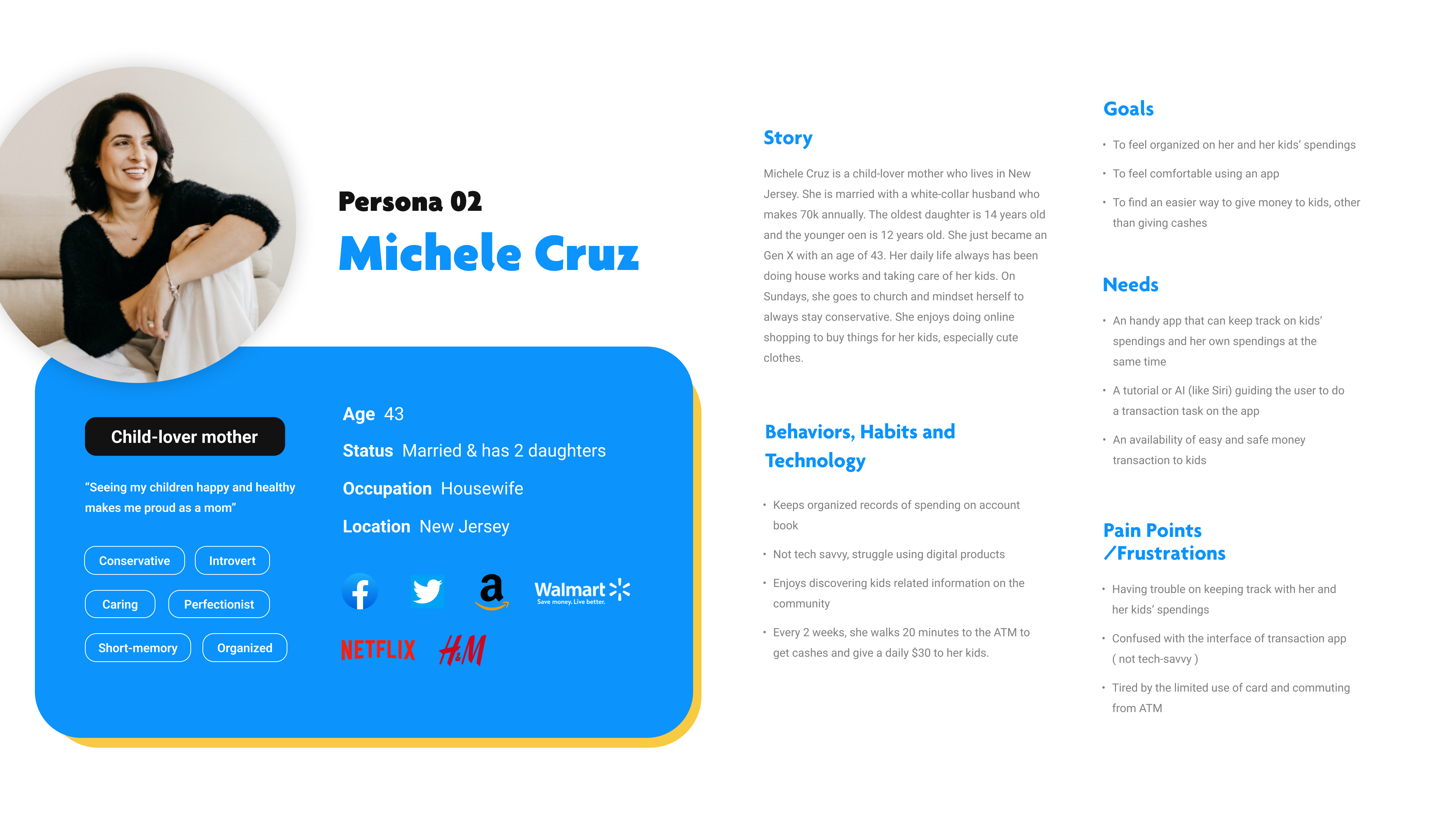
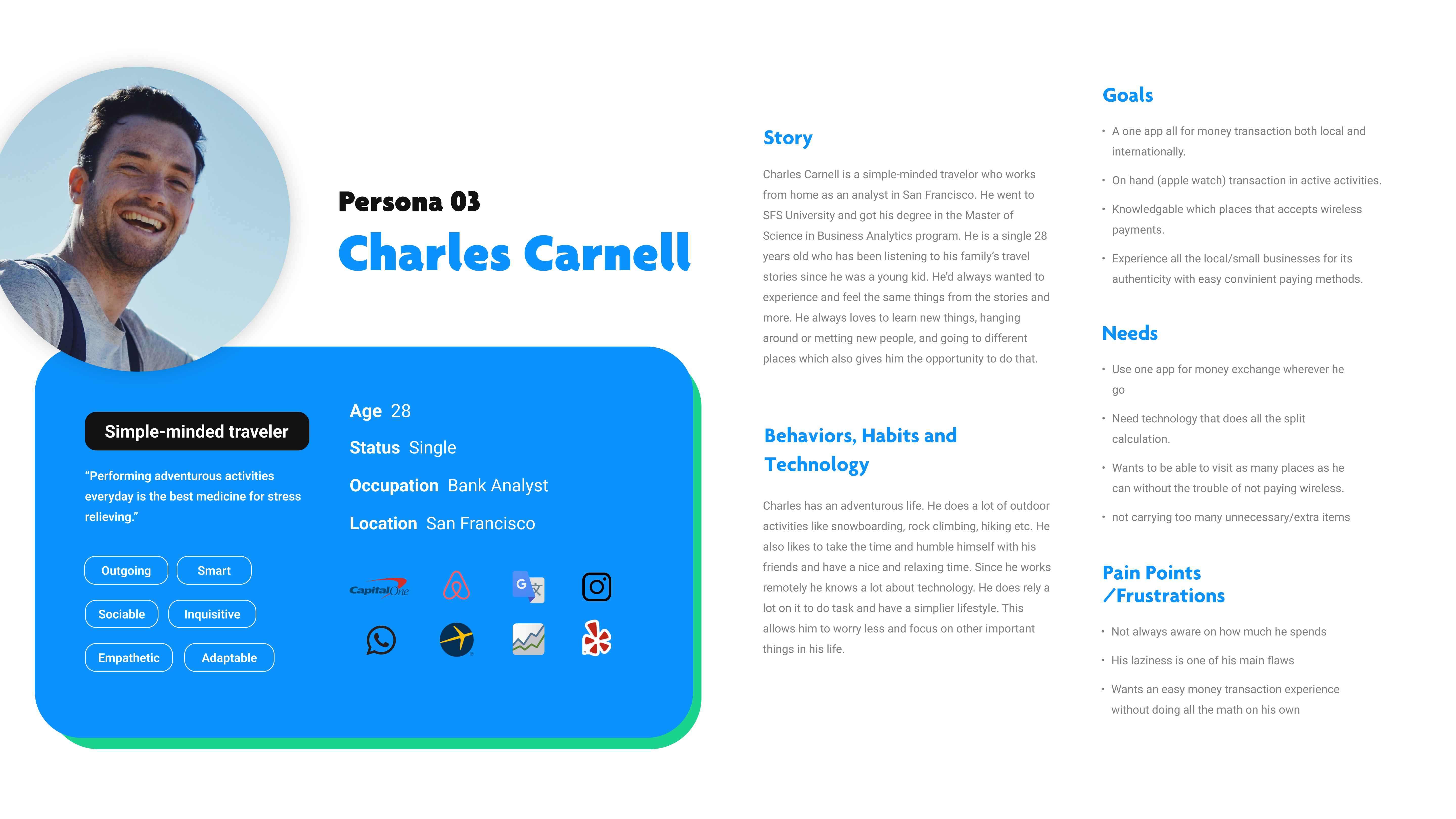
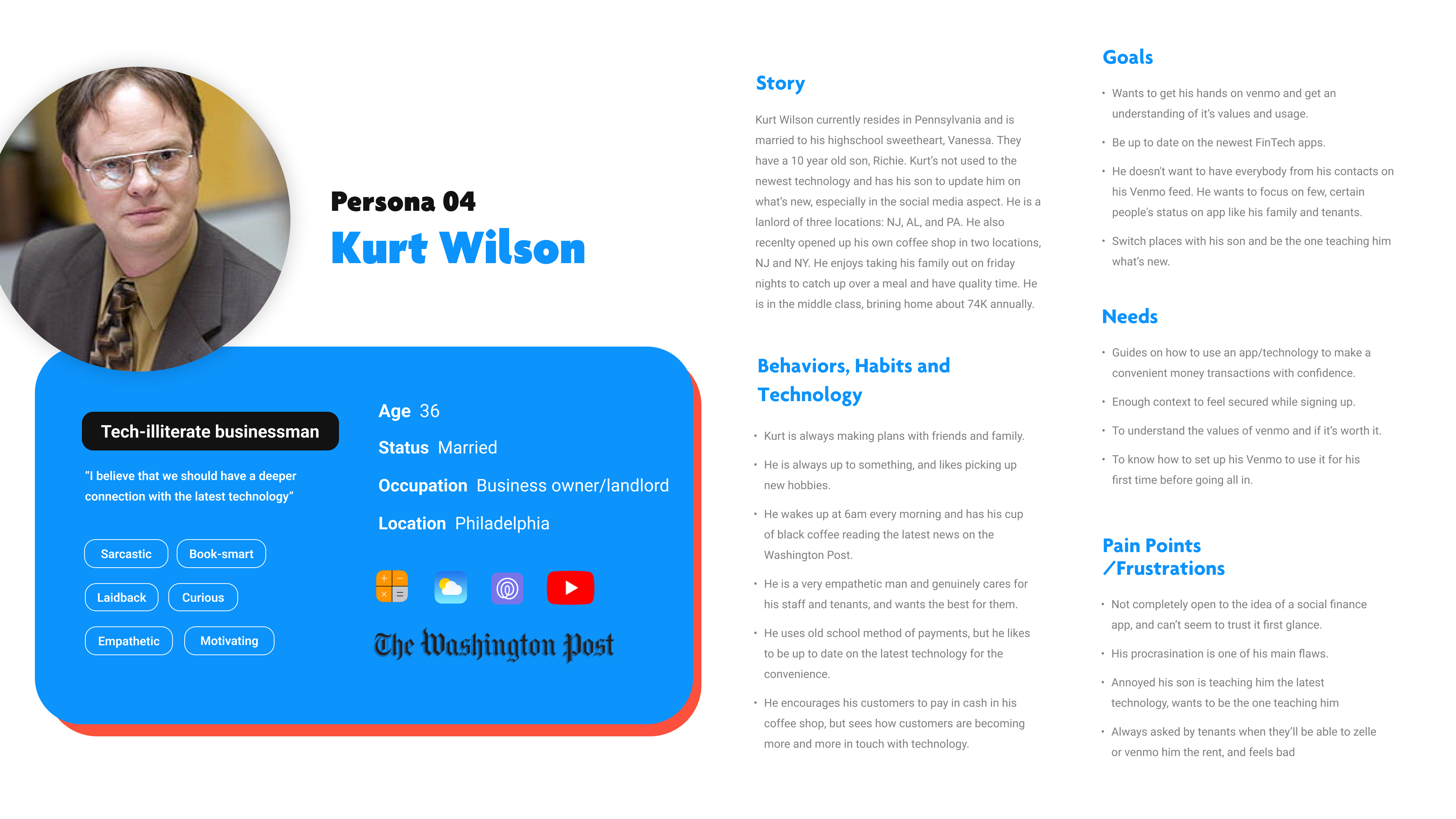
Personas were built based on the data collected to help drive decision making and keep the product focused on solving users pain points, frustrations, and goals.
When developing the personas we focused on keeping a wide variety of users in our mind as money management affects all age and income groups.
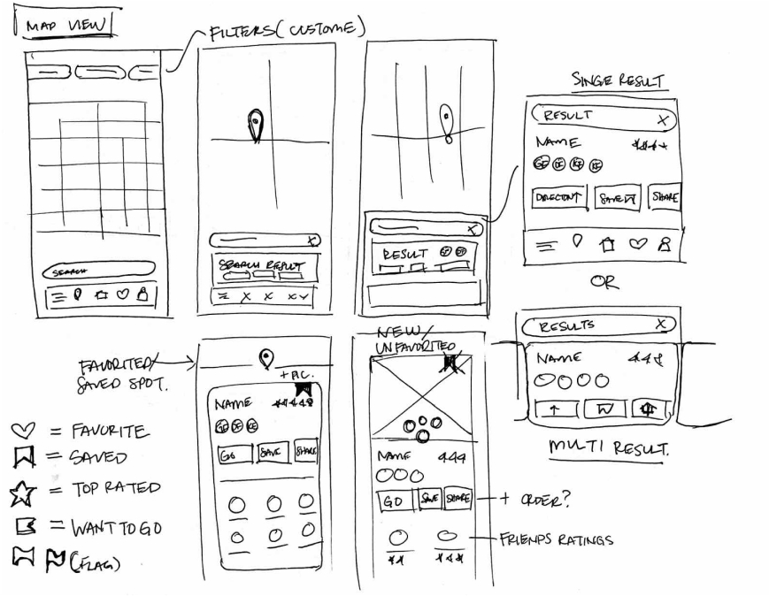
The primary user flow is the process of searching, saving and sharing with friends.
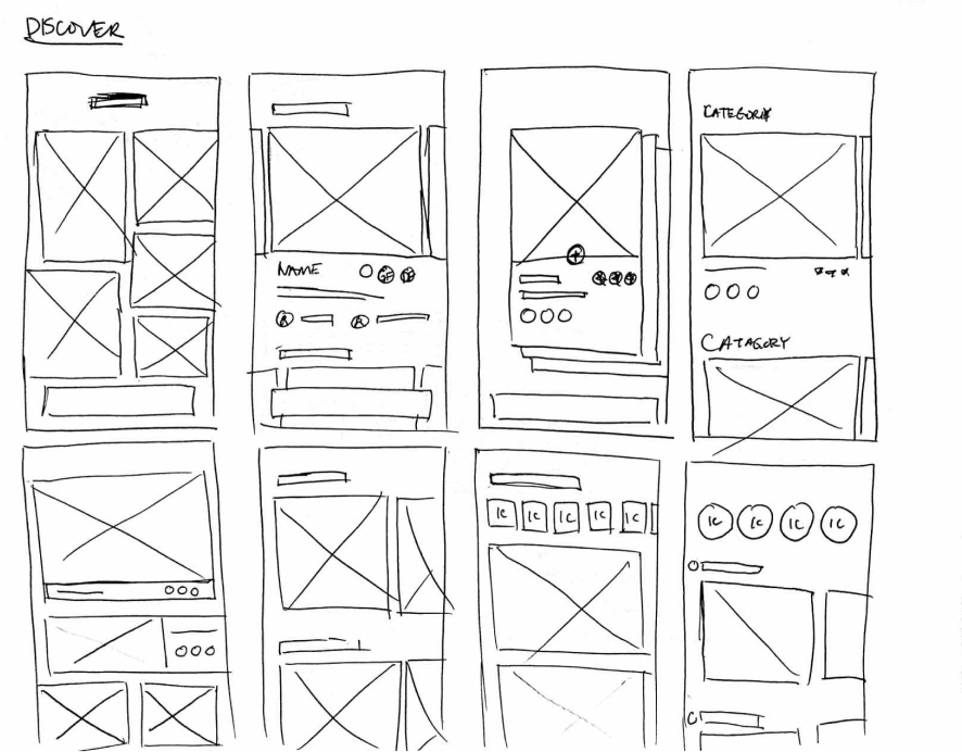
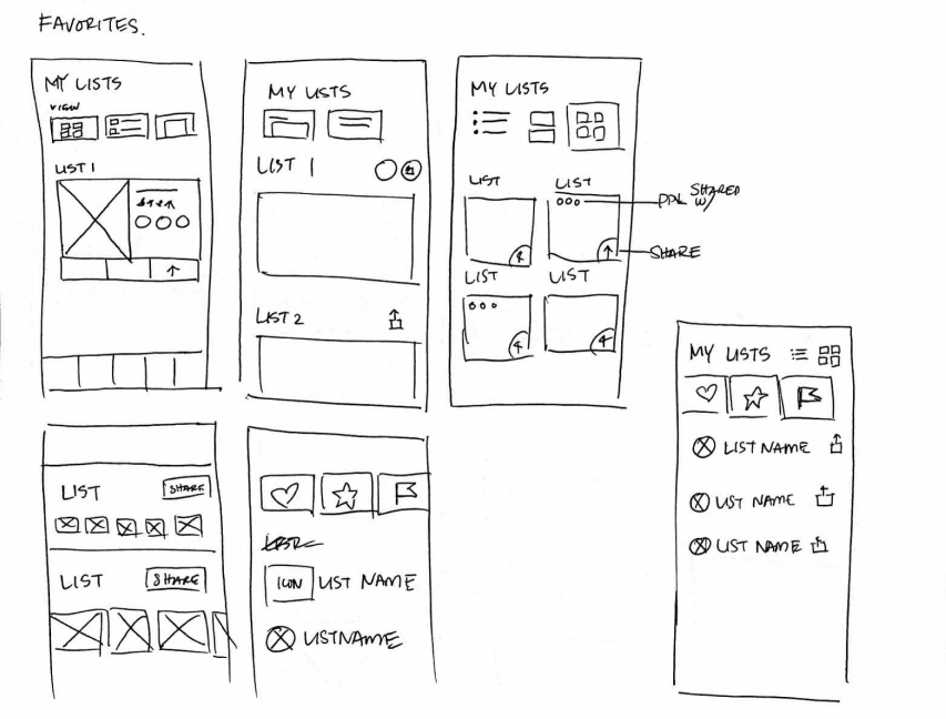
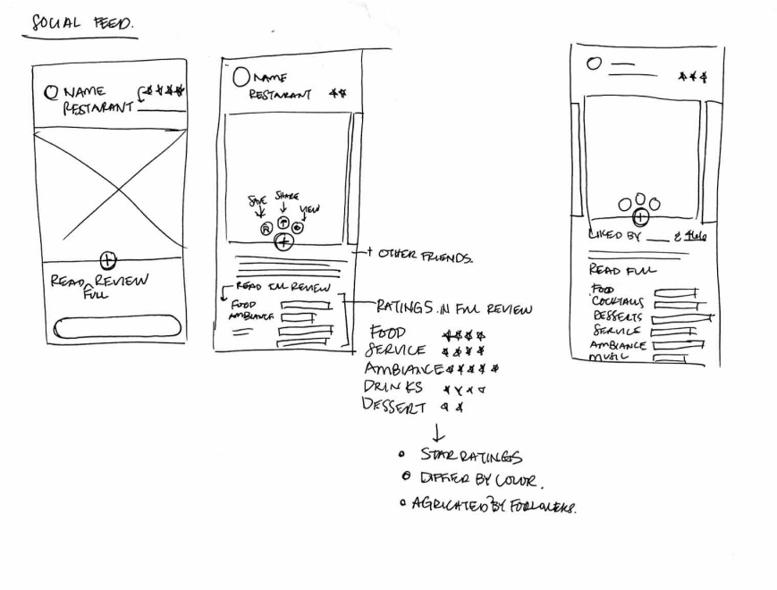
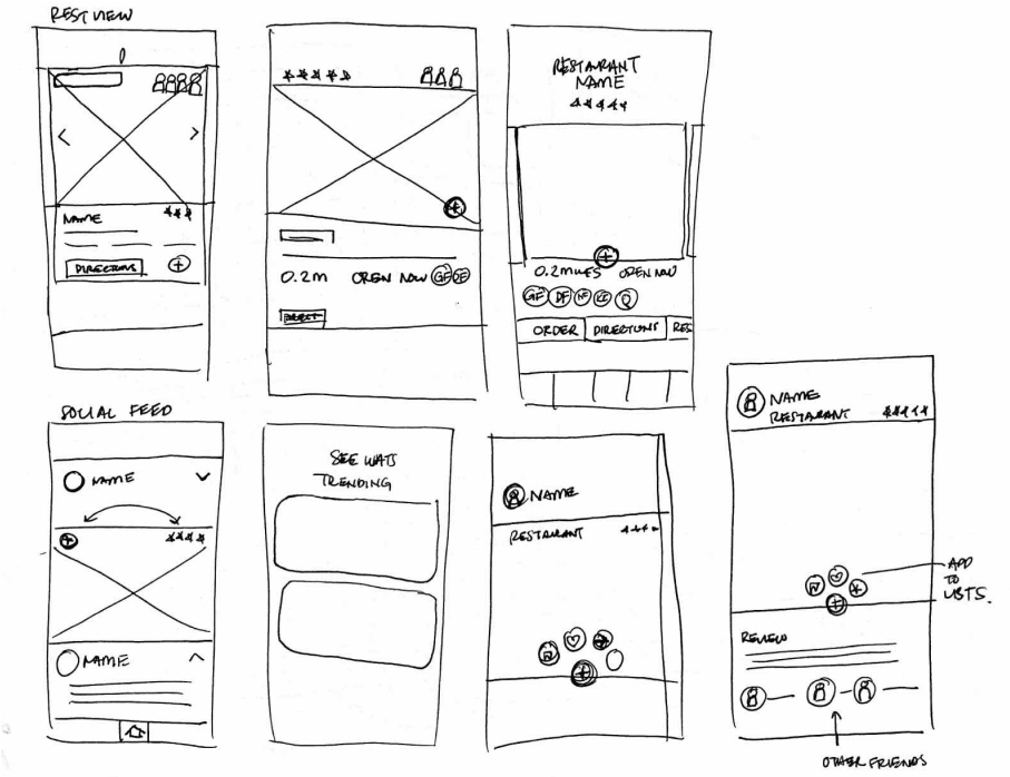
To kick-off the design process, quick sketches helped me get ideas on paper to establish which elements were necessary for each screen. A low fidelity prototype was then created for initial user testing.
The primary user flow is the process of searching, saving and sharing with friends.

YUM's simple information structure makes it easy to navigate and move through tasks.

Rough sketches were done to get my initial thoughts on paper and brainstorm new ideas for specific UI elements.
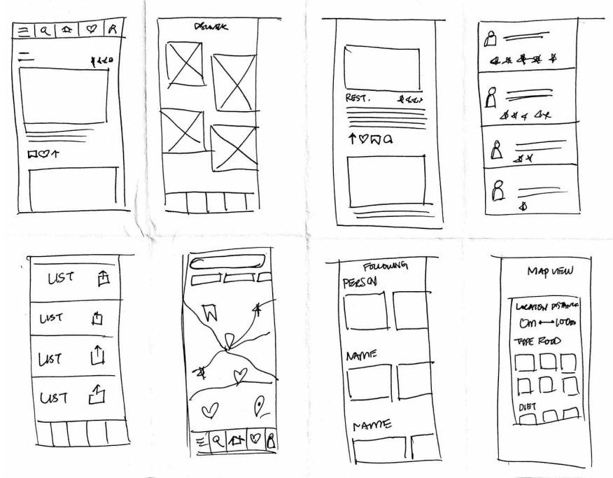
Using the feedback and insights gained from research, analysis and sketching, a how-fidelity prototype was created to begin user testing.
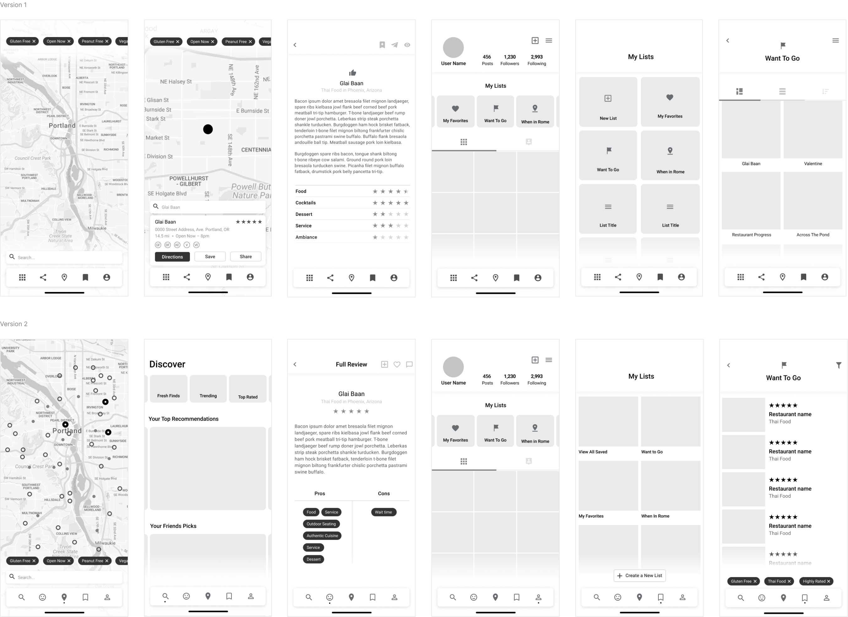
A usability study was conducted to determine where improvements could be made and identify new ideas to satisfy user expectations, needs, and desires.
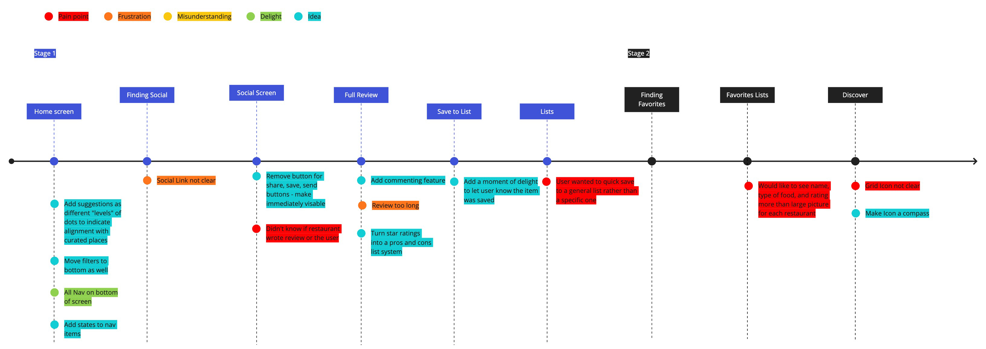
Source of restaurant review was unclear
Quick save option not available, had to specify which list to save to
Emphasis on photos made it difficult to find type of food and restaurant ratings
Use color to differentiate YUM's suggestions from a users saved restaurants
Remove multi-step process to find social icons and make immediately visible
Add a moment of delight to let the user know a restaurant was saved